Gantt Chart: Practical variations
The Quality Toolbook >
Gantt Chart > Practical variations
When to use it | How to understand it |
Example | How to do it | Practical
variations
<-- Previous |
Next
-->
Practical variations
- Color or mark tasks on the critical path differently (typically in red), to highlight the fact that slipping these will cause the project end-date to slip.
- Sort tasks by their start date before showing them on the chart. This makes it easier to see what is scheduled at any one time, with bars generally going from top left to bottom right.
- A Linked Bar Chart shows the dependencies between tasks by drawing arrows between them, pointing from one task to the other tasks that follow it, as in the illustration. This combination of the Activity Network and Gantt Chart can be useful, but can also become messy if there are a large number of dependencies.
- Show the work breakdown structure on the Gantt, with different colored or shaded bars to indicate summary tasks, as in the illustration. Other information, such as total time may also be calculated for each summary task, by summing information from other tasks that it contains.
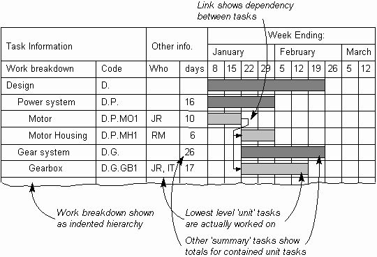
Fig. 1. Showing work breakdown structure and dependencies
- Show actual progress against plan by using two bars for each task. The first bar represents the original plan, and does not change. The other bars shows the actual time taken and reflect the latest estimates.
- Show people or other resources in the first column, instead of tasks. The actual tasks can either be shown indented from each person's name or written on the appropriate bar. This can result in a smaller diagram, with multiple bars on the same row, as in the illustration.
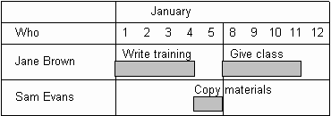
Fig. 2. People or other resources
in first column
- Show slack time on the chart, as in the illustration, to indicate where tasks may slip without affecting the project end date.
- The Delphi Method can be used to use a group to estimate task
duration.
- The effective progress of a project can be measured by calculating the Project Progress Rate, which indicates the real 'months of progress per month'. This may be calculated and plotted as in the illustration. This clearly shows if the project is ahead of schedule or is falling behind schedule.
- The measure is quite scalable, for example months can be replaced by weeks or even days. It can also be applied to a single task, a complete project or even a whole set of projects.
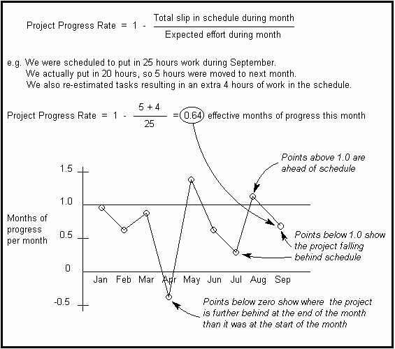
Fig. 3. Calculating Project
Progress Rate
<-- Previous |
Next
-->
|


