The Psychology of Quality and More
|
|
The Psychology of Quality and More |
|
A Toolbook for Quality Improvement and Problem Solving (contents) |
Gantt Chart: How to understand itThe Quality Toolbook > Gantt Chart > How to understand it When to use it | How to understand it | Example | How to do it | Practical variations
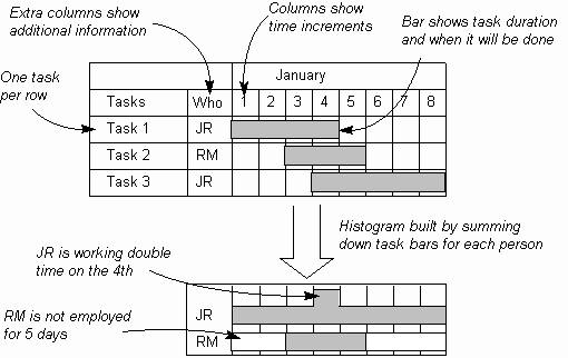
How to understand itWhen planning for activities within a project, it can be difficult to get a clear picture of what is being done, when and by whom. Tools such as the Activity Network can be used to calculate dates, but it is still not immediately clear which tasks occur at the same time and can result in people being scheduled to work on several tasks simultaneously. The Gantt Chart is a simple horizontal Bar Chart, where bars represent the actual calendar time which is planned for each task (see Fig. 1). The scale used for the time will depend on the overall size of the project and the estimation increment used.
Fig. 1. The Gantt Chart and Resource Histogram
Other information may be added to the chart, such as the resources required to complete each task (people, machines and materials), as shown in Fig. 1. This helps the management of the task in several ways:
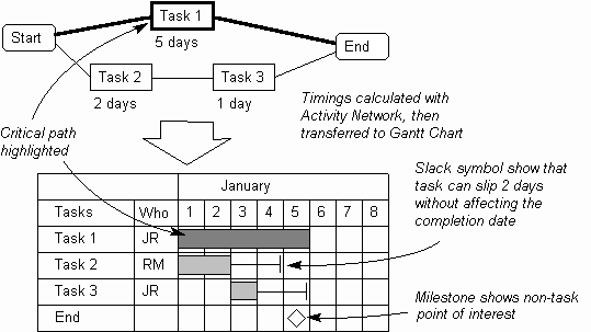
A disadvantage of the Gantt Chart is that dependencies between tasks are not shown, which can lead to tasks being ordered wrongly. This can be addressed by using an Activity Network beforehand, to calculate realistic start dates for each task. Other items from the Activity Network including slack time, tasks on the critical path, and milestones may also be displayed on the Gantt, as in Fig. 2.
Fig. 2. Comparing the Activity Network and the Gantt Chart
Optimizing the schedule through rearranging tasks and resources is often aimed at reducing the total slack time, and may also result in a reduction in the total calendar time required to complete the project. This is called leveling or load balancing. Tasks are often shown as a hierarchy, where the lowest level tasks (or unit tasks) are those which are actually worked on by someone. The higher level tasks (called summary tasks) serve only to 'contain' lower level tasks, helping with their identification and understanding. The way they commonly appear is shown in the illustration.
|
Site Menu |
|
Quality: | Quality Toolbook | Tools of the Trade | Improvement Encyclopedia | Quality Articles | Being Creative | Being Persuasive | |
|
And: | C Style (Book) | Stories | Articles | Bookstore | My Photos | About | Contact | |
|
Settings: | Computer layout | Mobile layout | Small font | Medium font | Large font | Translate | |
You can buy books here |
|
And the big |