The Psychology of Quality and More
|
|
The Psychology of Quality and More |
|
A Toolbook for Quality Improvement and Problem Solving (contents) |
Control Chart: ExamplesThe Quality Toolbook > Control Chart > Examples When to use it | How to understand it | Example | How to use it | Practical variations
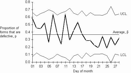
ExampleAn accounts department started an improvement project to try to reduce the number of internal purchase forms that its users completed incorrectly. As an overall measure of their success, they used a p-type Control Chart to measure the proportion of purchase forms that were not completed correctly. This was chosen, rather than measuring the actual number of defects, because any number of defects on a form required about the same effort to revise. Each point on the chart represented all purchase forms for one day. This was chosen as it allowed a 25-point chart to be drawn reasonably quickly. This subgroup size was permissible as, even though the number of forms in each group was less than 50, the number of defective forms in each subgroup was more than 4. A Pareto Chart indicated that the development department made most mistakes, and a survey indicated that they did not understand the form. On the 15th of the month, a half-hour training class was held for the development people. The table and illustration below shows the calculation and Control Chart for the month. It can be seen that after the training, there were nine points in a row below the center line indicating a statistically significant improvement. In the next month, the proportion defective was further reduced by extending the training to other departments. Before long, there were so few wrongly completed purchase forms that the subgroup period had to be extended to one week.
Table 1. Example
Fig. 1. Example Control Chart
Other examples
|
Site Menu |
|
Quality: | Quality Toolbook | Tools of the Trade | Improvement Encyclopedia | Quality Articles | Being Creative | Being Persuasive | |
|
And: | C Style (Book) | Stories | Articles | Bookstore | My Photos | About | Contact | |
|
Settings: | Computer layout | Mobile layout | Small font | Medium font | Large font | Translate | |
You can buy books here |
|
And the big |