The Psychology of Quality and More
|
|
The Psychology of Quality and More |
|
A Toolbook for Quality Improvement and Problem Solving (contents) |
Scatter Diagram: How to do itThe Quality Toolbook > Scatter Diagram > How to do it When to use it | How to understand it | Example | How to do it | Practical variations
How to do it
Make the measurements as specific as possible in order to reduce variation and increase the chance of a higher correlation. For example, measurements from a single supplier's materials may be better than measuring all supplied materials. Be very careful when measuring human behavior, as the very act of measurement can cause the measured people to change their behavior, especially if they suspect they may lose out in some way. If investigating a possible cause-effect relationship, plot the suspected cause on the x-axis (horizontal) and the suspected effect on the y-axis (vertical).
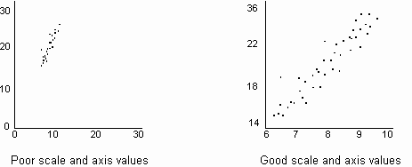
Fig. 1. Setting the scale
When using a Scatter Diagram to estimate future effect values, only estimate within the known range of correlation, as the shape may change outside that range. Note: Scatter Diagram calculations are on a separate page.
|
Site Menu |
|
Quality: | Quality Toolbook | Tools of the Trade | Improvement Encyclopedia | Quality Articles | Being Creative | Being Persuasive | |
|
And: | C Style (Book) | Stories | Articles | Bookstore | My Photos | About | Contact | |
|
Settings: | Computer layout | Mobile layout | Small font | Medium font | Large font | Translate | |
You can buy books here |
|
And the big |