The Psychology of Quality and More
|
|
The Psychology of Quality and More |
|
A Toolbook for Quality Improvement and Problem Solving (contents) |
Matrix Data Analysis Chart (MDAC): How to understand itThe Quality Toolbook > Matrix Data Analysis Chart (MDAC) > How to understand it When to use it | How to understand it | Example | How to do it | Practical variations
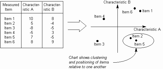
How to understand itWhen comparing a large set of items, the complexity of the situation can make it difficult to determine how different factors relate to one another. In particular, it can be useful to find groups of items that behave in similar ways. For example, a washing powder may have different efficiencies at achieving 'softness' and 'stain removal' in garments made of acrylic, polyester, wool and various fiber mixtures. If similar affects are found in a group of fibers, then changing the powder ingredients may affect the whole group in a similar way. The Matrix Data Analysis Chart (or MDAC) helps classify items by identifying two major characteristics common to all items and then plotting each item as a point on a standard x-y chart. This makes it easier to see how the individual items relate both to the characteristics and to one another, thus:
Fig. 1. MDAC plot
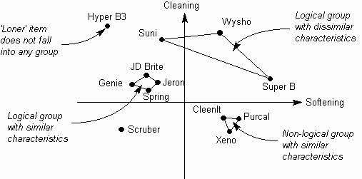
A key interpretation point about an MDAC is to consider how points on the chart group together or form into clusters (this may be contrasted with the Scatter Diagram, which looks for linear trends). This interpretation is helped by highlighting significant groups of points with linear links, as in Fig. 2.
Fig. 1. Clustering
Typical items of interest on an MDAC include:
|
Site Menu |
|
Quality: | Quality Toolbook | Tools of the Trade | Improvement Encyclopedia | Quality Articles | Being Creative | Being Persuasive | |
|
And: | C Style (Book) | Stories | Articles | Bookstore | My Photos | About | Contact | |
|
Settings: | Computer layout | Mobile layout | Small font | Medium font | Large font | Translate | |
You can buy books here |
|
And the big |