QualityTools Web 


Home

Quality
Toolbook

Tools of
the Trade

Improvement Encyclopedia

Quality
Articles

Quality
Links

Changing
Minds

Creating
Minds

Syque

About

Share this page:


Books and
more at:

USA:

In association with amazon.com

UK:

In Association with Amazon.co.uk

Canada:

In Association with amazon.ca


Line Graph: Practical variations

The Quality Toolbook > Line Graph > Practical variations

When to use it | How to understand it | Example | How to do it | Practical variations


<-- Previous | Next -->


Practical variations

  • Use point markers to emphasize the value at each point. Omit them to emphasize the overall shape of the graph.
  • There are a number of common ways of showing different point markers and lines to enable them to be distinguished (see the illustration). If available, color is a very good differentiator.


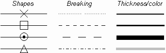
Fig. 1. Differentiating lines
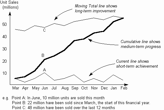
  • Where a line varies up and down a lot, a simple way of drawing a trend line is a 3-point average. In this, for each point, a new point is plotted which is the average of the previous, the current and the next point.
  • In an Area Graph, the area beneath the line is emphasized by filling it in (often in color). This can be used as a variation on a Stacked Bar Chart.
  • A Z-Chart plots on one chart the current, cumulative and moving total figures for any measured value across time, as in The illustration. It is useful for showing progress in both the short and longer term. The current line shows the variation each period, whilst the moving total smooths out any seasonal variations, showing longer term progress. The cumulative line joins these and may show progress towards a goal.


Fig. 2. Z-Chart


<-- Previous | Next -->


  © Syque 2002-2007

TOP

Massive Content -- Maximum Speed