The Psychology of Quality and More
|
|
The Psychology of Quality and More |
|
A Toolbook for Quality Improvement and Problem Solving (contents) |
Bar Chart: ExamplesThe Quality Toolbook > Bar Chart > Examples When to use it | How to understand it | Example | How to use it | Practical variations
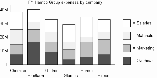
ExampleA corporate finance department regularly reported expenses of group companies in a Bar Chart, which was then used to help identify improvement opportunities. It was noticed that the company with the highest expenses also had the highest overhead costs. A subsequent project to improve this situation broke down these costs further, using a Pareto Chart. Solutions to the problems were found through the experiences of another group company that had already succeeded in reducing its overheads to the lowest in the group.
Fig. 1. Example Bar Chart
Other examples
|
Site Menu |
|
Quality: | Quality Toolbook | Tools of the Trade | Improvement Encyclopedia | Quality Articles | Being Creative | Being Persuasive | |
|
And: | C Style (Book) | Stories | Articles | Bookstore | My Photos | About | Contact | |
|
Settings: | Computer layout | Mobile layout | Small font | Medium font | Large font | Translate | |
You can buy books here |
|
And the big |