The Psychology of Quality and More
|
|
The Psychology of Quality and More |
|
A Toolbook for Quality Improvement and Problem Solving (contents) |
Histogram: How to understand itThe Quality Toolbook > Histogram > How to understand it When to use it | How to understand it | Example | How to do it | Practical variations
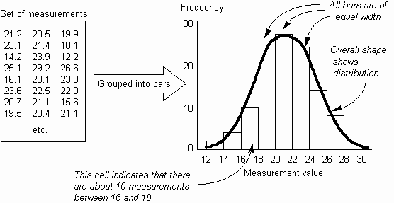
How to understand itWhen measuring a process, it often occurs that the measurements vary within a range of values. By understanding how these measurements vary, the effects of the process and changes made to it can be better understood. The Histogram shows the frequency distribution across a set of measurements as a set of physical bars. The width of each bar is constant and represents a fixed range of measurements (called a cell, bin or class). The height of each bar is proportional to the number of measurements within that cell. Each bar gives a solid visual impression of the number of measurements in it and together the bars show the distribution across the measurement range. Fig. 1 shows how the distribution of measurements can be seen far more clearly in the Histogram than in a table of numbers.
Fig. 1. Grouping a set of measurements into a Histogram
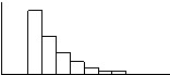
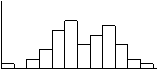
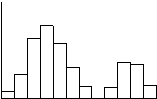
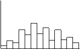
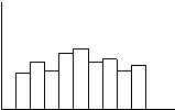
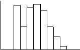
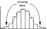
In drawing the Histogram, there must be a sufficient number of measurements to be able to give a usable shape to the distribution. The number and width of the bars are also important; if the bars are too narrow, then insufficient measurements will fall into each bar to give it significant height. Similarly, if the bars are too wide, there will be too few bars to give a useful shape to the distribution. Common Histogram shapes are shown in Table 1. Problems may be indicated by the distribution being naturally non-bell-shaped or by problems with the measurement. When a distribution differs from the expected shape, the underlying process should be examined to find real causes of this.
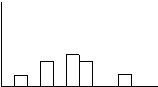
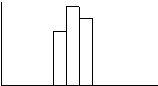
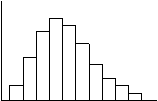
Table 1. Histogram patterns
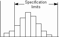
If the variation within the process is random, then the Histogram will follow a Normal (bell-shaped) curve, otherwise the shape can indicate a problem. If it is bell-shaped, then likely future values can be predicted by using the standard deviation, as described in Chapter 5. Other distribution shapes are possible, but less common. The expected shape can be determined by plotting a series of Histograms for a process that is known to be performing correctly; any significantly differing shape can trigger an investigation into the cause. If the process has specification limits defined, then the Histogram should be centered between these limits. An off-center distribution, as in Fig. 2, can result in many items which are out of specification. Other measurement problems around specification limits, are shown in Table and can be caused by a system which penalizes people for reporting measurements which are out of specification.
Fig. 2. Histogram showing distribution falling outside specification limits
|
Site Menu |
|
Quality: | Quality Toolbook | Tools of the Trade | Improvement Encyclopedia | Quality Articles | Being Creative | Being Persuasive | |
|
And: | C Style (Book) | Stories | Articles | Bookstore | My Photos | About | Contact | |
|
Settings: | Computer layout | Mobile layout | Small font | Medium font | Large font | Translate | |
You can buy books here |
|
And the big |