The Psychology of Quality and More
|
|
The Psychology of Quality and More |
|
A Toolbook for Quality Improvement and Problem Solving (contents) |
Affinity Diagram: How to understand itThe Quality Toolbook > Affinity Diagram > How to understand it When to use it | How to understand it | Example | How to do it | Practical variations
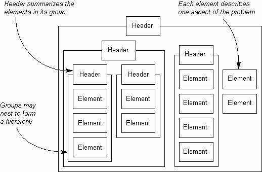
It is not unusual when working on a project to find a chaotic situation where there are many individual pieces of information held by different people, but no clear picture of the overall problem. The result is often that there are a number of theories and significant disagreement about which is right. Affinity Diagrams bring order into such uncertain situations by organizing the pieces of information into related groups and then describing the primary characteristic of each group with a 'header' or 'affinity' title. This process can be repeated so that a hierarchy of groups is built up, as illustrated in Fig. 1.
Fig. 1. Affinity Diagram build-up
A key difference between the Affinity Diagram and other tools is that it builds the hierarchy 'bottom-up', starting from the basic elements and working up, as opposed to starting from the top header and working down. Affinity Diagrams are most commonly built using the 'KJ' method (named after Kawakita Jiro, its originator), which aims to stimulate creative, 'right-brained' thought, rather than logical 'left-brained' thought, by banning discussion during the building of the diagram. The concept of left- and right-brained thinking comes from Nobel-prize winning work that identified how the left hemisphere of the brain is used more for logical, verbal activity, whilst the right hemisphere is used more for creative, non-verbal activity. By deliberately not using left-brained speech, the KJ method encourages the creative right brain to become more active. This silent activity also has the benefit of avoiding discussions that could become heated or otherwise drift away from the real problem at hand. The result of building an Affinity Diagram should be a problem that is better understood, particularly in the way the individual elements of it fit together into related groups. Affinity Diagrams are often most useful when they break the problem into fairly small groups which have creative headers. Large groups of elements (typically five to ten or more), particularly with predictable headers such as 'Finance' can indicate that the elements were classified using a logical existing system, rather than by creative affinity grouping. A good affinity group may have elements that at first sight do not seem to fit well together and have an unusual header, but which when considered with an open mind is understood and throws new light on the problem.
|
Site Menu |
|
Quality: | Quality Toolbook | Tools of the Trade | Improvement Encyclopedia | Quality Articles | Being Creative | Being Persuasive | |
|
And: | C Style (Book) | Stories | Articles | Bookstore | My Photos | About | Contact | |
|
Settings: | Computer layout | Mobile layout | Small font | Medium font | Large font | Translate | |
You can buy books here |
|
And the big |