The Psychology of Quality and More
|
|
The Psychology of Quality and More |
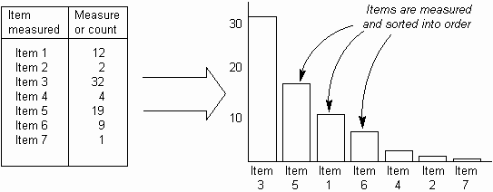
Pareto ChartThe Pareto Chart, at its simplest, is a Bar Chart in which the bars are sorted into size order, with the highest bar on the left.Where there are many items with small values, they may be lumped together into an 'other' category and put on the right. Typically, the chart is used to highlight problems or things requiring work. The ideal chart is 'spiky', with a high left bar, as this clearly shows the best thing on which to work. Note that the height of the bars implies priority. Usually the bars are a count of defects or problems. They may be weighted, for example by cost, to improve the prioritization effect.
See also:Pareto Analysis, Pareto Curve, Pareto Principle, Pareto Pyramid, 80-20 rule, Joseph Juran, Vilfredo ParetoToolbook chapter: Pareto Chart |
Site Menu |
|
Quality: | Quality Toolbook | Tools of the Trade | Improvement Encyclopedia | Quality Articles | Being Creative | Being Persuasive | |
|
And: | C Style (Book) | Stories | Articles | Bookstore | My Photos | About | Contact | |
|
Settings: | Computer layout | Mobile layout | Small font | Medium font | Large font | Translate | |
You can buy books here |
|
And the big |